
BigPay analytics section redesign
The business wanted to increase engagement through the app. Most of users have been using the product abroad due to great currency exchange rates and my task was to transform those sporadical users into every day users.

About BigPay
BigPay is one of the fastest growing fin-tech business in South East Asia. It offers great exchange rates for expenses outside Malaysia. For every purchase done with BigPay, users collect AirAsia points and can manage their expenses through the app.
The problem
Users who sign up to the app love the product but they use it only for their trips abroad and to buy AirAsia tickets. Users don’t find the value of using the app on a daily basis.
The process
User quote:
“I use BigPay as a budget tool, I top up the amount I want to spend for the month.”
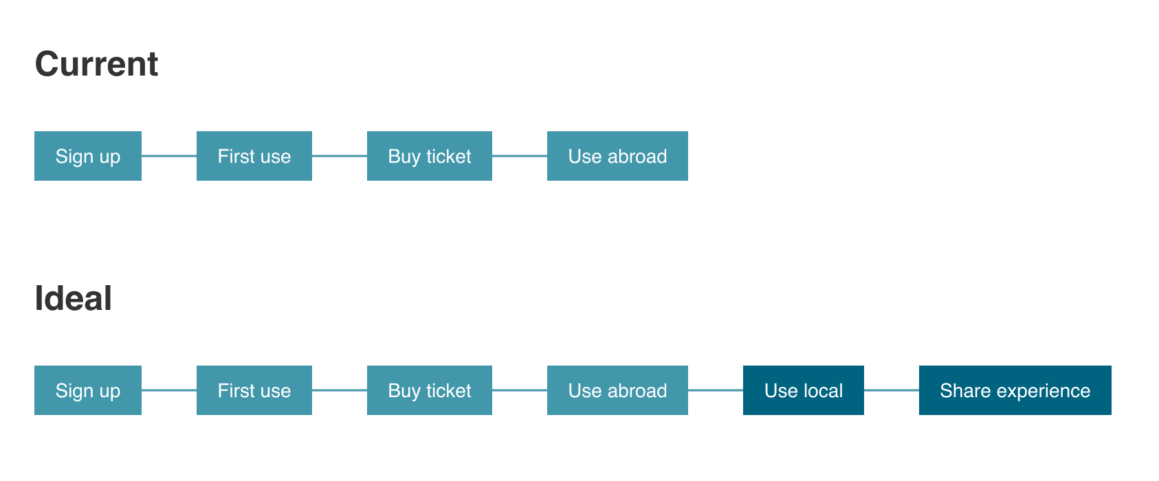
Find out the use case:
We have performed interviews and focus groups with a series of users. The meetings were quite informal and the idea was to get feedback about how they used their cards. Features, frequency, likes, dislikes.
Many of them used the card abroad only but among them we found a particular case. Some users said they were using the card as a budget tool. They would top up their BigPay account only with the amount they were wishing to spend during the month. Boom we had our use case.
The use case
Since many users were interested in budgeting we thought we could convert more people by giving them tools to manage their finances and eventually use their BigPay card for everything.
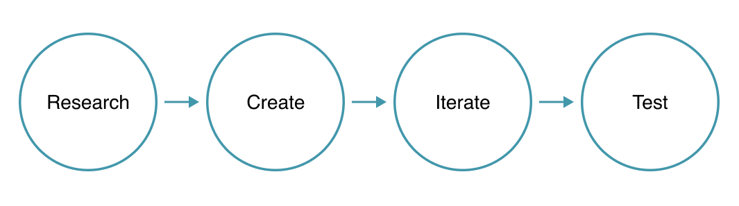
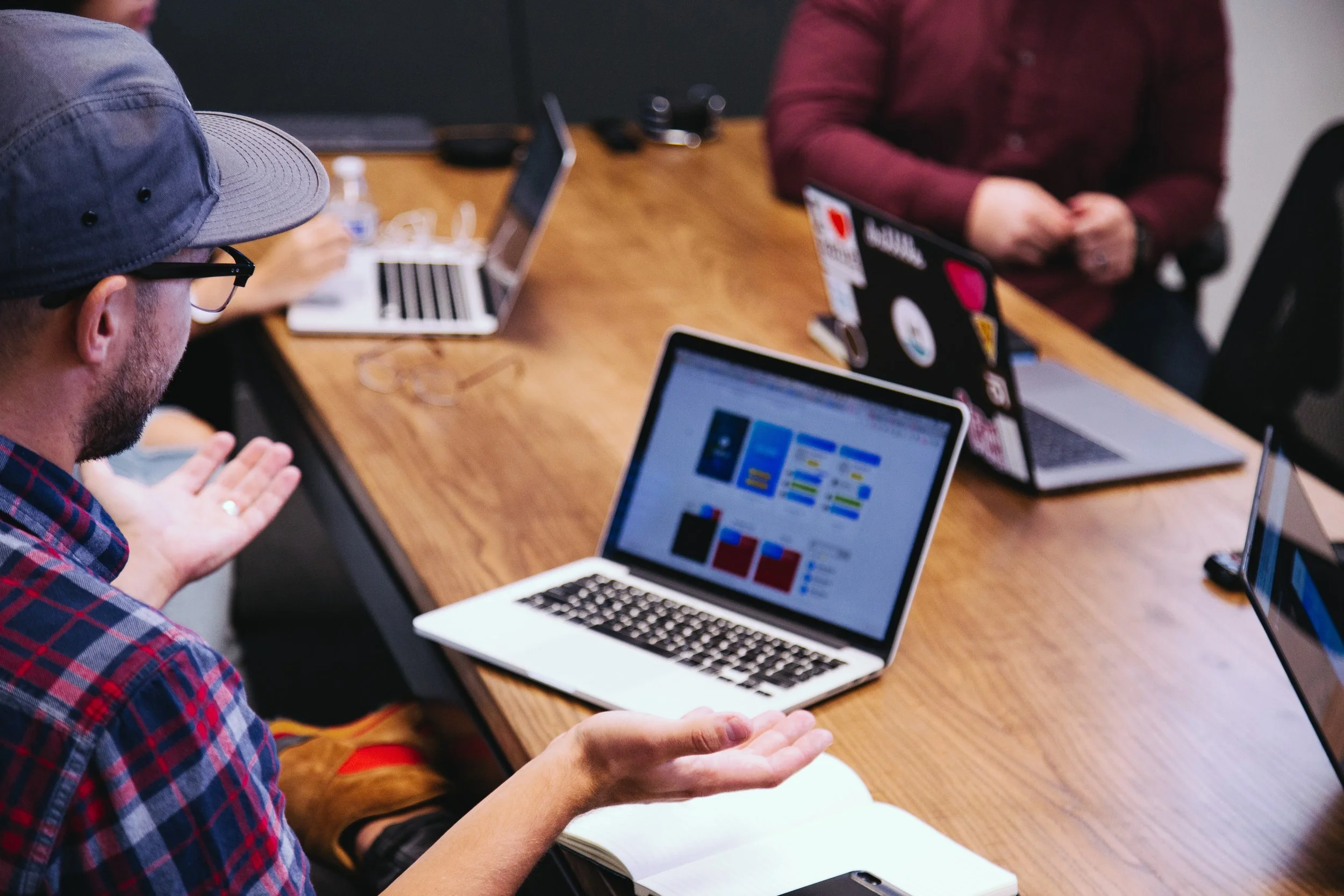
Creative Process
We knew what we were trying to achieve, then was time to put creativity in practice. We had a 2 weeks sprint and wanted to stick to the timeline but go through all phases:
Mood board
Persona Creation
Empathy map
Matrix evaluation
Iteration
Set KPIs
Design and handover
Moodboard
Moodboards are a great way to start a project so as your brain start to frame the problem you already start to come up with solutions in your head. Aha moment fuel.

Persona creation
We have created a persona based on the target user business has provided. Everything is easier to validate when you have a persona to ask.

Empathy map

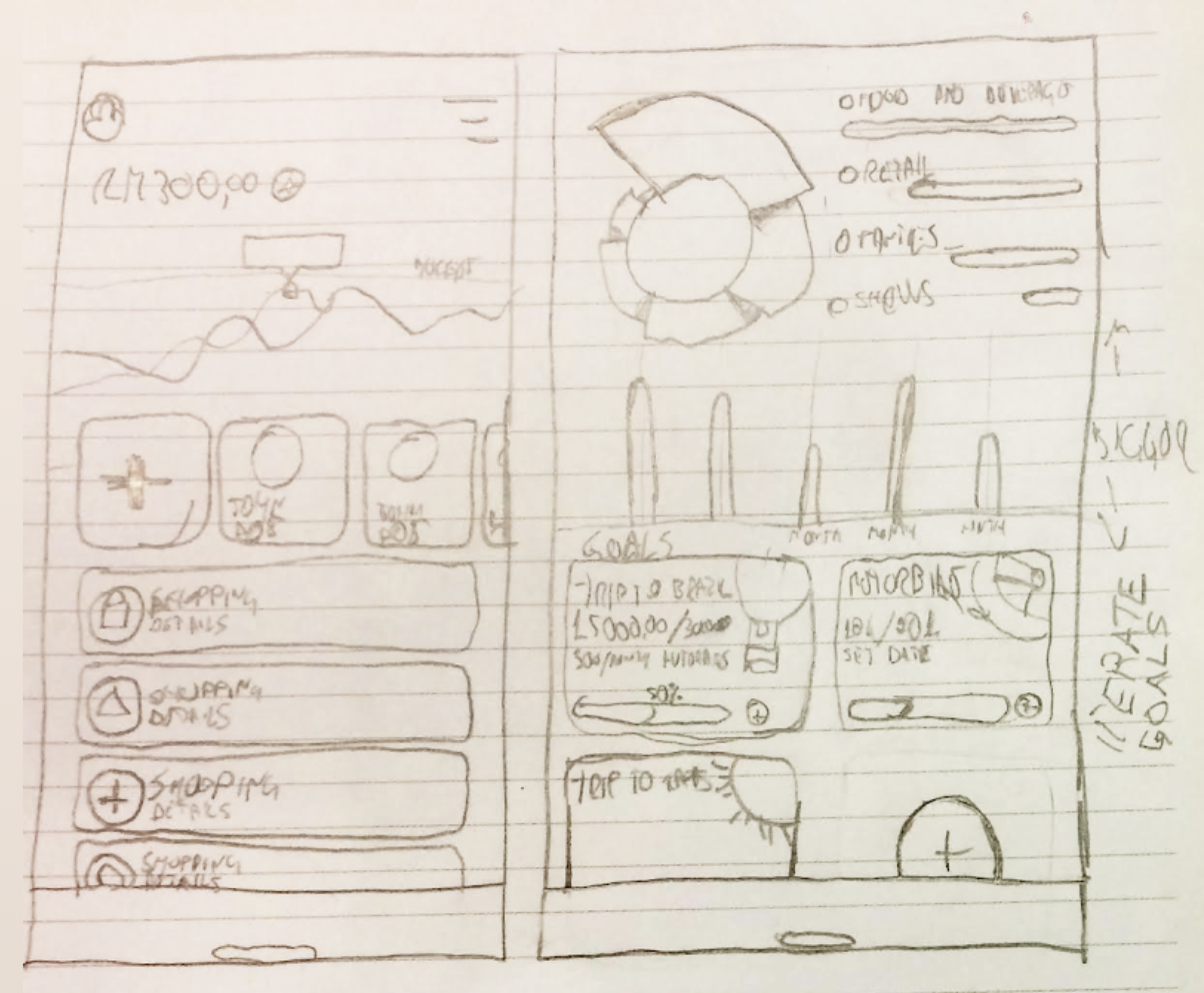
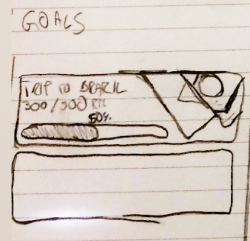
Rough Work
It’s not pretty, but it’s the most important stage of the creative process. In this stage we have framed all the pieces of the task and started to create many different solutions. The idea is to come up with as many ideas as possible. Fast sketching.
Feature Mapping
It really helped us to evaluate features and to start to have an idea of the information architecture. We wanted to give insights that would add value to the user on a daily basis, hence those were prioritised.


Competitive Analysis
We don’t have many direct competitors, but we have a lot great products we get inspiration. It helped us to benchmark the features of concepts vs market, it is easy to evaluate what should go into design stage, rates developer implementation effort and gives a rough idea of features to be implemented.
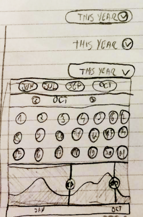
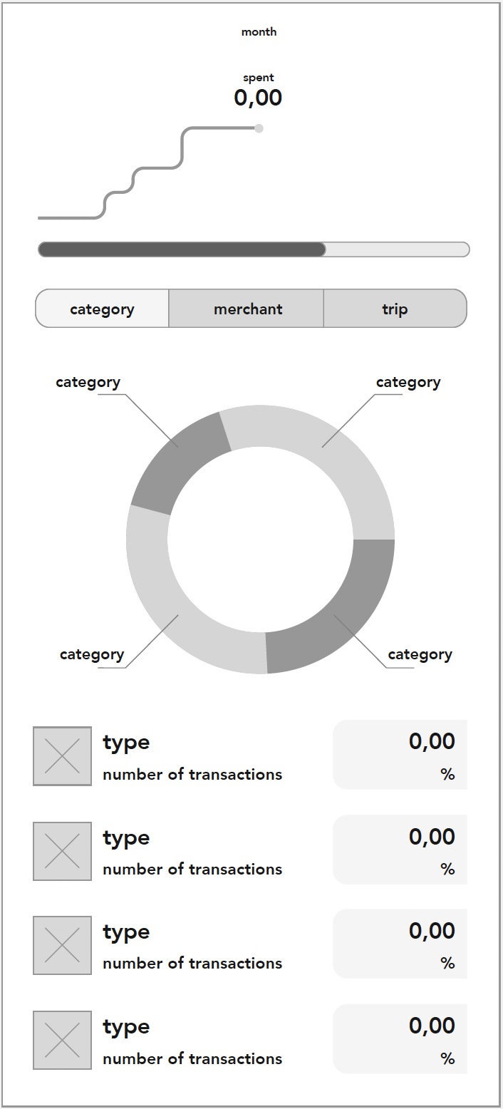
Interface iterations
There were literally dozens of iterations with UI. At this point more, is more.

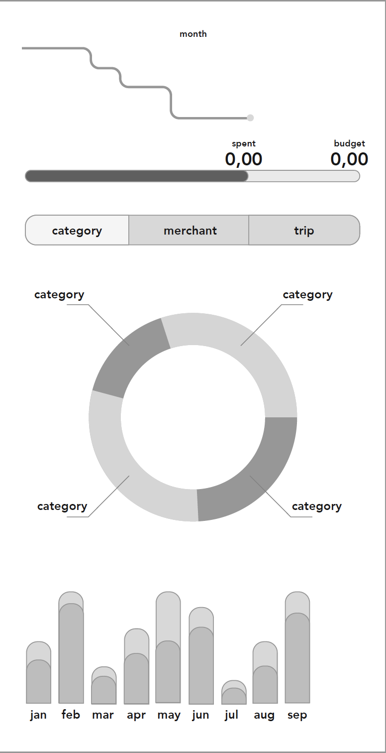
#1 Iteration
This was the end of the first week. We had created a high fidelity interface we were happy about it. It had all the key information for users to make use of every day. So how to evaluate?
Prototype
We had many questions about the first iteration and needed to test the design. For this project we decided to use Marvelapp for the prototype. Instead of showing people different mockups and asking their opinion, we have showed only one design and asked them if they could identify key information. Every person had a link to the prototype and a sheet with questions.
After asking the users to go through the prototype we asked questions about the overall look and general feedback.
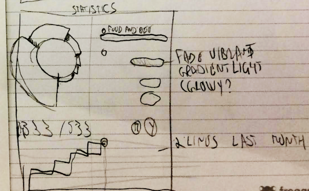
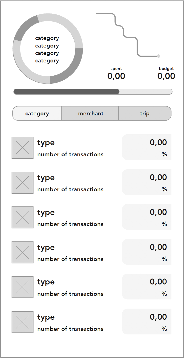
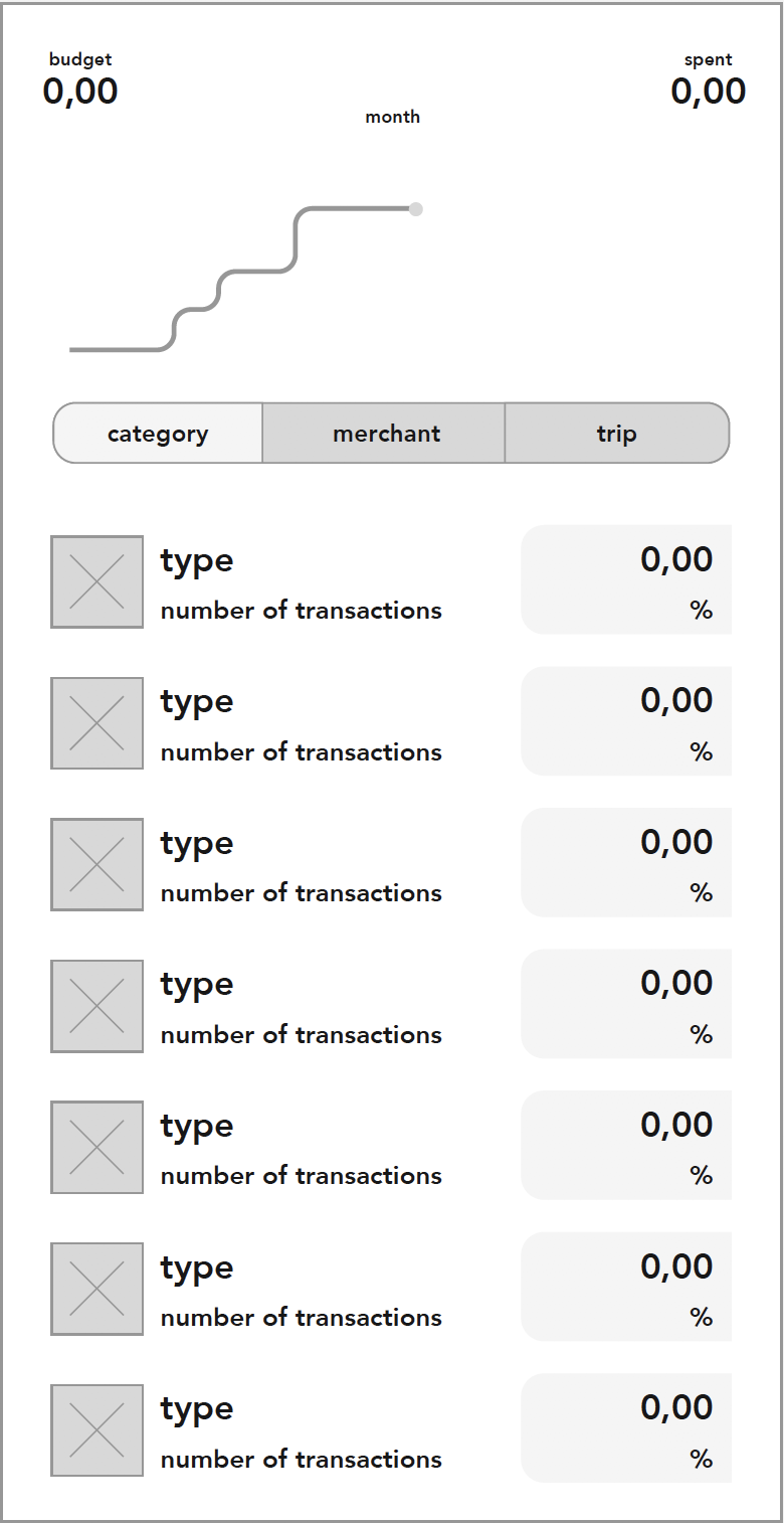
Final Version
End of week 2. We spent most of the time preparing prototypes and conducing testing.
Based on feedback we removed information that was not clear and we were ready to prepare files for handover.
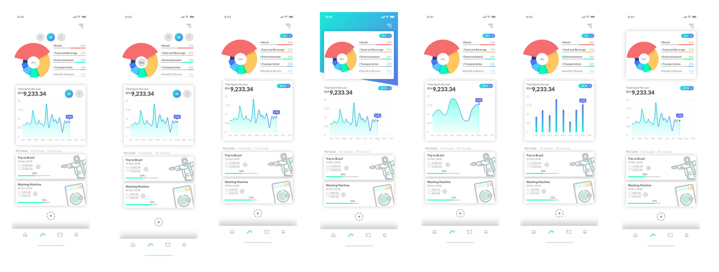
Having a team in another part of the world imposed some challenges to team. Every exception needed to be mocked up and every interaction needed a video to describe the interaction. We have used After Effects to create the videos and send to developers.

Release
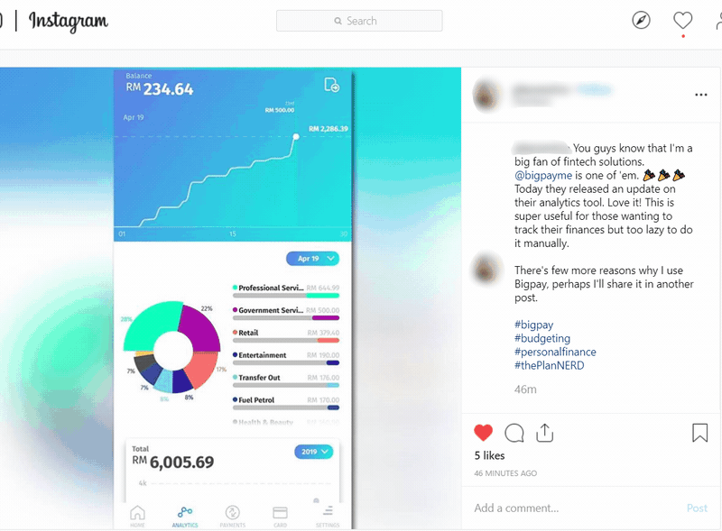
After much testing we were ready super psyched to release the new feature and super anxious to see the feedback from the users.
Marketing team came up with an amazing video to promote the update.
Feedback
“The analytics on @bigpaymeapp gives me the breakdown of my expenses in pretty colours! I’ll use it as my primary card so it can capture all my monthly expenses.”
— Happy user
We instantly received very positive feedback on social media, but the real confirmation was the fact that users were starting to engage more frequently with the app and not only when they were travelling.
Data
We stablished some key performance indicators to evaluate the success of the redesign. Here are some results: