BigPay - Peer to peer money transfer
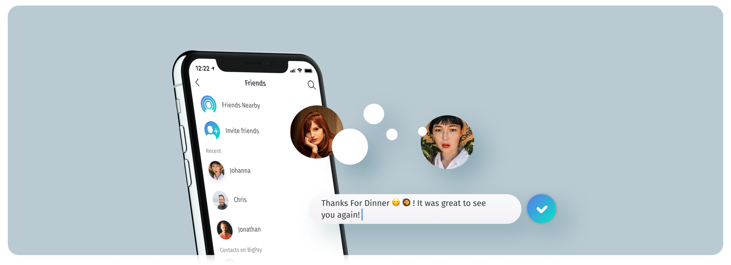
Transferring money from one BigPay account to your friends? Easy.
Project profile
Back in 2018, BigPay was still very new in Malaysia. I was tasked to build a popular feature that enable Malaysian to make instant money transfer money to another BigPay account.
Time 2018
Role Lead Product Designer
Contributions 1. Research 2. User journey 3. Ideation 4. Low / hi-fi design
Research
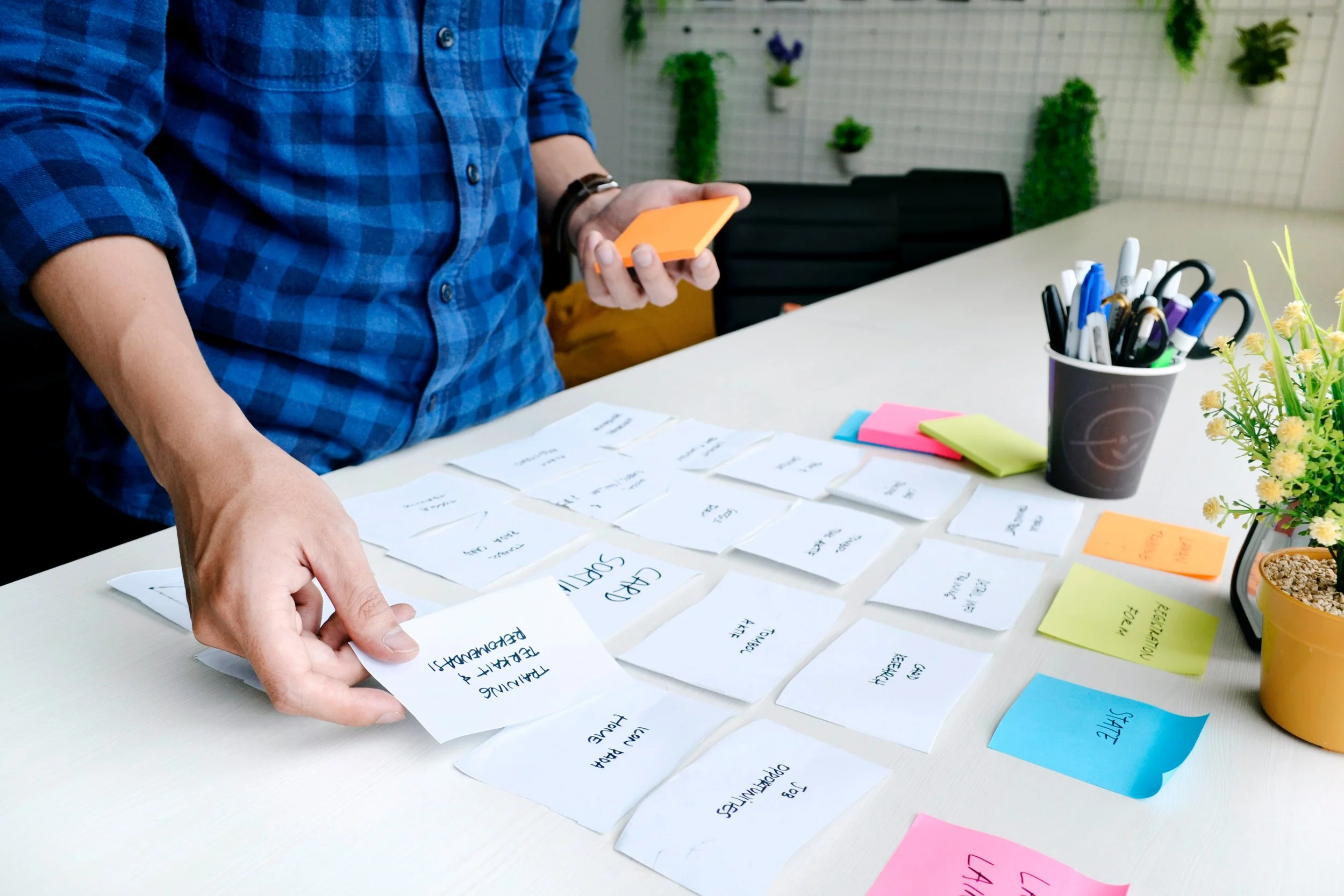
P2P money transfer is very popular in the west because the user journey is seamless, instant and free of charge. Likewise, BigPay would like to offer the same benefit to local users. I research some of the popular fintech app like Revolut, Monzo to help me to map user journey and UI benchmarking.
User journey
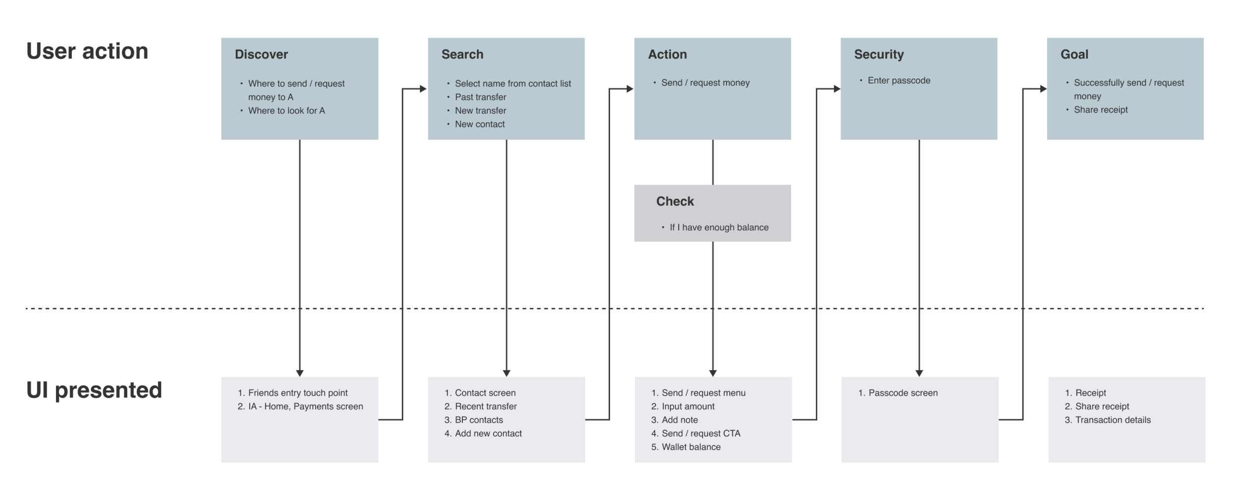
The flow based on user mental model as how we use to transfer money to friends by online through local banks. P2P transfer make it even more simpler as there’s no user account number required. This is a quick money transfer service.
Hi-fi user journey
Finally, few round discussion with lo-fi designs, we come out complete user journey for for P2P money transfer
Key screens
Animation
I also created a pull and release animation to encourage the user to interact with the functionality, instead of just pressing a button. We really wanted to push interaction to the limit so to understand if that would have an impact over user engagement.
We knew that we were pushing too hard on the interaction side but we were ready to do that and then polish out whatever was not working.
Video animation interaction
The “cash” Element
One of the most challenging points of the animation was the the “cash” element. The currency a friend was going to send to another. The obvious element to use would have been a coin, but management wanted to steer away from it as it is a medieval form of currency and we wanted to position ourselves as modern way of sending money.
So after many attempts using several types of elements we opted for a very simple white “molecule“ as it is plain and can give a sense of byte or digital element.
Molecule element
Caching!
Use of sound is one of the most underrated and unexplored aspects of product design that can have a huge impact in usability yet with so little effort.
Many of our users were using the send money functionality many times a day. By sending them a distinct sound every time they receive money on our app creates a subliminar positive connection with the brand.
Even without realising, users started to associate that specific sound with something positive as receive money, open our app, engage with our product. That’s psychology applied to product design right there.
We wanted to create a sound that ascended building up and also that gave a sense of hitting, knocking, falling.
So I mixed 3 different sounds from Audiojungle. A magical whoosh, a success hit, and a coin.
Release and Feedback
After much testing we were ready super psyched to release the new feature and super anxious to see the feedback from the users. Initially users were impressed with the new flow but eventually users reported the interaction would take too much time to happen.
We did a round of interviews and reduced some elements of the flow that were making the process slower like the pull and release.
The exercise was of great value to understand what level of interaction is worth to put in development or not. There is just so much to do in terms of gamification but not many devs available.


