Bold.io Dashboard Concept and Website
About Bold
Bold.io is a bitcoin-backed credit card with bitcoin rewards. It allows instant access to credit after your collateral is deposited in multi-signature collaborative custody.
The problem
The business was in the very early stages of conceptualisation and needed help designing first a dashboard that allowed basic functionalities to be performed and then a beautiful website that showed the product’s value propositions.
The process
This was the design process proposed to stakeholders at the beginning of the project:
Design Brief (Problem Statement)
Persona (based on mailing list)
Product Value Proposition
User Journeys
Wireframing
Prototypes (lo-fi) - Goal to complete this and above for wk 2.
Moodboard
High fidelity mockups - Goal to complete up to here in week 3.
Protoypes - Goal for weeks 4+, along with Mobile app.
Design Brief
The stakeholders were on a tight deadline to finish the first concept so the creative process was very lean. I wanted to go through most parts of the process even if it was briefly so we opted for short versions of each of the main stages of the creative process. Starting with the Design brief.
I spent some time getting to know the product by doing my own research and having conversations with the team to get a better idea of who the customers were and what pain points they were facing currently.
Persona
The business had a very clear target user in mind. Making the persona design very straightforward. It helped also to have such a specific type of user in mind instead of a broad persona.
So to get info for the business I laid down some questions to start to get a feeling of what type of users would we will be designing for. These were the questions:
Who are we designing for?
What are their challenges?
What do they want?
How do they feel?
This was the final Persona card
Value Proposition
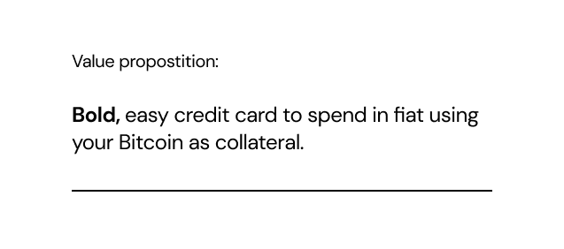
A compelling value proposition is critical for effective product design and marketing, as it helps to guide development and communication efforts, and provides a clear understanding of what the product offers to the customer, and why they should choose it over competitors. We just simply put it this way:
User Journeys
Establishing these before starting to design the actual prototype is very critical to define the scope of the project and meeting deadlines. Without this consense the project could turn into an infinite task, running the risk of never getting to the stage of testing the performance of the designs. We came up with 10 different user journeys, which is a lot for a concept, but they were quite simple.
Low Fidelity Wireframes
From all the user journeys the trickier part was the collateral section, as it was impacted by the price of BTC, so it could get quite volatile. Once we got that out of the way it was easy to design the rest of the wireframe.
We got all the user journey flows readily on the wireframe and defined all screens that should have been designed in high fidelity.
High Fidelity Mockups
The stakeholders were quite convinced about the look and feel the app should have so, that was pretty easy to come with. The most important decision here was to use a robust design system from the beginning. We chose MUI Design System as it was a quite complete library with very light code.
One of the core design principles was to keep the visual language consistent across the product while having enough variations to create a unique character on each screen.
After changing the main components of the design system it was very quick to design each screen re-using the same components.
Prototyping
Definitely, the most time-consuming part of the project. Usually, prototypes will show only one or two flows at a time, but this was meant to show all flows defined in the user journey section to give a realistic view of the product to the board and investors.
This is the final result of the prototype with all navigation and transitions defined.
Website Design
The challenge here was to design something graphically appealing without a brand guideline. So I opted to focus on the product aspects of the brand and used a lot of mockups showing the main value props in real use.


